Past Exhibitions
Exhibition Works
Exhibition Text
There is an overwhelming physicality to the art of Amanda Gruenwald.
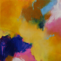
Gruenwald's large-scale canvases dominate with their colour, but also have a visceral solidity to them, in part informed by her making process. The artist begins each work by pouring initial shapes onto a flat canvas, shapes which form the basis for the artist's intuitive process of repeated addition and removal of paint. The process leads to an ongoing discovery of the painting by the artist. The removal of paint is in some ways the more important part of the technique, with the paint drawn back to reveal spaces and depths.1 The result is work in which the thickness of the paint varies across the canvas, and the multiple layering in the images create a three-dimensional topography as much as a simple wash of colour. These canvases are not placid lakes, they are roaring oceans, with wave crests and deep troughs into which the viewer dares to venture at the risk of drowning in the art.
The images have clear influences from the mid-twentieth century colour field artists such as Clyfford Still and Helen Frankenthaler, but there is a connection to earlier modern art here. Much of the work has an impressionistic landscape-like element, in terms of the sculptural nature of the surfaces and rich earthy colours. The use of contrasting hues - cobalt blue and yellow, orange and azure - also brings to mind the experiments in colour contrast by Robert and Sonia Delaunay which led to Orphism. Like the Delaunays' work, colour here is a solid object, and the borders between opposites produce visual and psychological phenomena which suggests that the hues are moving with a life of their own. Yet despite these antecedents, Gruenwald's work is original and fresh, using early influences as a springboard from which her works have developed and grown.
Gruenwald's intuitive creation of art is influenced by the artist's attitude towards the aggressive palette of modern architecture. She views the "gauche colour punctuated by grey" 1 which decorates our urban world as almost a physical assault, one which has led for many to a subconscious escape from the joys of colour. We retreat into our colourless wombs, living in concrete grey houses in concrete grey suburbs, chained to a concrete grey computer feeding us concrete grey information.
Gruenwald's canvases are an antithesis and antidote to this trend. The colours take breath and leap from the canvas, challenging us to accept them at face value for what they are. The prosaic nature of the titles — simply lists of the colours used — focuses attention firmly on light as life and colour as an all-encompassing soul.
- Artist's statement, 2023


